Logo
All logos and logo variants here are saveable as SVG / vector format
(Right-click, save as…).
Logo Variations
All logos and logo variants here are saveable as SVG / vector format
(Right-click, save as…).
Goose Digital “G” Logo
Although it is always preferable to use the full Goose Digital logo, when space does not permit, the Goose “G” can be used instead in either the black or white variant.

Goose Circle
For exceptional circumstances, circle variant of the Goose “G” has been created. Use this when space is limited or to help accent the marketing materials (e.g. website favicon, navigation bars, or document header).
Goose Pixels
The Goose Pixels should only be used to help compliment the rest of the branding (e.g. as a footer image in a word document). They should never be used without the full Goose Digital logo elsewhere on the material.
Colors
Green 361 C
Primary "Solutions/Services" colour.
Blue 313 C
Primary "Expertise/Strategy" colour.
Sky 283 C
Supporting "Expertise/Strategy" colour.
Orange 158 C
A supporting colour, mainly used in technical/code related applications.
Red 1797 C
A supporting colour, mainly used as a CTA or to highlight news/blog posts.
Pitch
Only be used as the background colour for headers, footers, etcetera.
Grey
Always use this shade for text on light backgrounds.
Slate
A minor, in-between support shade.
Light
The colour of our "white" logo. Helps support pure white or in places where pure white would not work.
Gradient Suggestions
We use gradients sparingly, usually on a Call-to-Action, like a button or an icon. Here are some suggested gradients to use with the Goose Digital colours.

In Writing
Always capitalize Goose Digital.
Try to avoid using “www.” when typing out our URL. Never capitalize the letters in the URL.
Fonts


Images
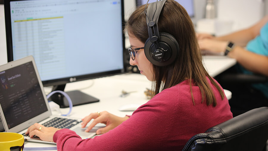
We love to use images at the top of all our marketing material to immediately grab someone’s attention. We use big, bold photography featuring real people in real situations. We always try to avoid overly-staged, unnatural colours and cutout stock photos.
Take a look at some examples below.