From Data to Insights: Tips to Start the Visualization of Your Marketing Story

Once you have collected, cleaned and identified the pieces of data you need for your next presentation with your boss or client, your next step is to figure out the best way to present these findings. It’s hard to convey your message using numbers on their own. Visual aids allow you to explain your results and tell a relevant story which will make it easier for your audience to understand and engage with your report and findings.
The challenge for most businesses today is that they have a lot of data, more than they actually need. This can be seen as either a blessing or a curse. With so much available data it can become overwhelming to filter through it all. This sometimes results in feeling the need to showcase all the findings – Suppress that feeling! Think about the story you are trying to tell and focus on the KPIs that are truly relevant. If the data doesn’t add value to your report or presentation – it has no place in it.
Here are a few points to keep in mind when building your report:
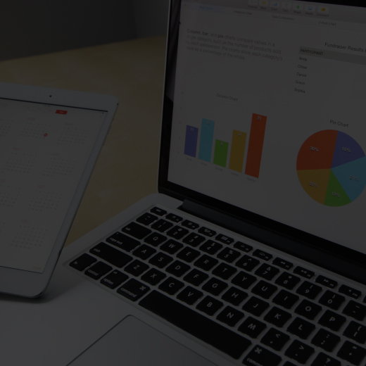
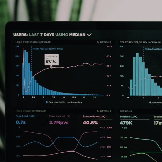
Stick to simple: If you have a good story and the data to back it up, you don’t need flashy charts. The classics are always reliable and will be easier to understand by the audience. These include:
- Bar graph
- Stacked bar graph
- Line graph
- Table
- Pie chart (only when you’re dividing a total into smaller pieces)
Think about your audience: For a successful presentation it is key to understand who you’re talking to. The same data, however important, might not be as relevant to a salesperson as it will to a marketer. Each team has their own goals and KPIs, so when you’re drafting your report tailor it to their individual needs. Some quick questions you should ask yourself are:
- Who is going to see this report/dashboard?
- Do they need a granular view of the data or would a more holistic approach work best?
- What is the purpose of this report? Showing campaign success, forecasting, sales trends from the past quarter, etc
- Do I have all the relevant KPIs?
- Is my data telling a cohesive story?
- Am I highlighting actionable insights?
Fit and finish: This might not sound as important but after all, you’re using visuals as the main vehicle to tell your story. The last thing you want is for your audience to be distracted by a non-critical detail, instead of deriving meaning from it. When finishing your report keep in mind correct chart and data points labelling, consistent brand colours and font sizes across all reports and insights.
These points will help you storyboard a concise and effective report that adds value by answering important questions and suggesting actionable items supported by your visualized data.
Need help assessing your own data and insights or defining your KPIs? Contact us today to learn more about how we can help.


![[Blog] Insurance Brokers: Focusing on Growth Today and Tomorrow](https://goosedigital.com/wp-content/uploads/2022/05/Featured-Ins-Brokers-Future.png)


![[Blog] How Marketing Automation and Data Can Be Your Insurance Brokerage’s Key Difference-Makers](https://goosedigital.com/wp-content/uploads/2022/03/Featured-MktgAuto-Data-Ins.png)